
 TCAP data was released last week, and the focus in Denver was an emphasis on median growth percentiles. Now I think academic growth is really important, and I’m on record as saying the Colorado Growth Model is one of the most significant developments in education in the state. But I also believe that our obsession with growth has gone too far.
Growth is a relative measure, so it is critical to understand not just the scores, but their distribution. For both anecdotal evidence and some data imply that it takes growth scores of at least one standard deviation from average (and possibly as much as 1.5 sd) before there is any real impact on proficiency. Allowing growth to obscure other metrics means that we are in danger of celebrating incremental progress in growth year after year without seeing any serious proficiency gains. And that does not serve students well.
For better or worse, life is set up to reward accomplishment more than improvement: nobody selects a surgeon or a lawyer based on how much better they are now than they were last year. Nor do colleges and organizations look at a student’s growth scores when making decisions about admissions or hiring. In truth, outside of school systems the designation of “most improved” is usually a blue ribbon, and as any kid can tell you, it’s a bit of a letdown. Growth is a valuable metric which we should use wisely, but it has to be viewed as a means to the desired ends of mastery and skill inherent in proficiency scores.
So how would I measure school performance in Denver? I believe the most meaningful measure for any school or system is exit-level proficiency (ELP). In Colorado, the best metric we have for ELP for high schools is 11th grade ACT scores; for middle schools it is 8th grade TCAP scores.
Now when using proficiency metrics to compare schools or districts there is an unpardonable offense: failing to adjust for income. So for 2013 school performance in Denver, I graphed exit-level proficiency in both 11th grade and 8th grade, compared to the percentage of tested students who take free and reduced meals (FARM), which is a measure of poverty (I’m experimenting with Tableau software, so click on the charts to get some interactive features plus the ability to download PDFs and the raw data).
Here is the result for high schools, where I look at the ACT scores of 11th graders in 2013 plotted against their FARM percentage the previous year (see notes). Both the number of kids in the grade and the type of school are visible on the chart as well.

What is important is the distance from the red regression line. Here, we see that DSST is in a class by themselves, both KIPP and CEC did well, and GW (who have a large magnet program although they are not a magnet school) is also above the line. Many schools thought of as high-performers (e.g. DSA and East) are pretty much exactly where they might be expected to be given their populations, while some schools often derided — such as North and MLK — are likewise just slightly above where one might expect them to be.
Particularly interesting are two things. First is the absence of any District-run high schools without magnet programs above the regression line. That’s a big issue and should be a considerable concern. Second is the extensive variation between schools with 80% or more FARM students, which range from an ACT average of 19.1 (at a magnet school) to 15.0. That’s the difference between attending college without remediation, and either never going or dropping out.
Let’s look at the same analysis for middle and K-8 schools, using the 2013 average proficiency scores for their 8th grades, compared again to the percentage of FARM students (see note):
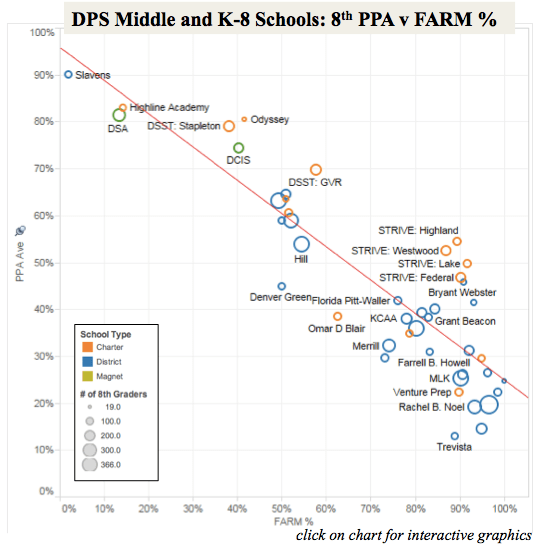
This is more crowded (click on the chart for details), and there are again a number of schools generally thought of as high performers who probably owe their success as much to their student population as anything else. In contrast, note the two DSST middle schools (GVR and Stapleton) which are roughly the same distance from the regression line, despite different proficiency and student demographics. And again, see the wide range of schools with FARM above 70% (roughly the DPS average), which varies from a high of 54% proficient students to 13% proficient students. Clearly some of these schools are doing far better than others.
So listen carefully to the conversations about growth, but when looking at Denver’s schools, keep in mind that what matters are growth scores that are significantly — not slightly — above average. And I would argue you should pay more attention to exit-level proficiency. In order for our schools to ultimately be successful for students, that is what matters most.
—-
Notes: CDE’s 2103 ACT scores are not broken down by FARM students, so I used the FARM percentage for the previous year in each school (i.e. 11th grade ACT in 2013 compared to 10th grade FARM percentage in 2012). Likewise, 8th grade 2013 TCAP scores by FARM students are not yet public (they will be), so I used 2012 FARM percentages for 7th grades. I believe both to be more accurate than the common practice of comparing the FARM percentage of an entire school to the proficiency score of a single grade. I will try to update these when the current FARM numbers are publicly available.

Pingback: How to Improve Denver’s School Performance Framework | Ooms With A View
Alex,
Strong article. I think there is a better – and much simpler way – way to see which schools have the most value add on students that qualify FARM. Can you report out the average ACT or TCAP score of just the students that qualify FARM at each school? Or, the average ACT of juniors (who entered freshman year with partially proficient and/or unsatisfactory 8th grade CSAP scores) by school?
Pingback: Voices: The problem with growth scores | EdNewsColorado
Pingback: The Problem with Growth Scores | Ooms With A View